

Get 5 Free Credits

Free Calibri Italic Font Generator Online

Create clean, right-leaning humanist sans-serif text with a restrained wordmark feel suited to editorial headings.

Enter the text to generate, e.g. Fontify.ai

Font color
Background
Templates
95
Generations
74
Downloads
282
Rating
5.0

How to Use the Calibri Italic Font Generator

Shape clean, right-leaning lettering for readable wordmarks, titles, and editorial graphics.

  1. 01

    Write your heading

    Enter a short wordmark, name, or heading to render in the clean italic sans-serif style.

  2. 02

    Set the visual layout

    Choose font color, a custom background, or an image size such as 16:9.

  3. 03

    Generate and download the image

    Generate the preview, review the slanted lettering, then download the finished PNG or SVG image.

Calibri Italic Font Style Profile

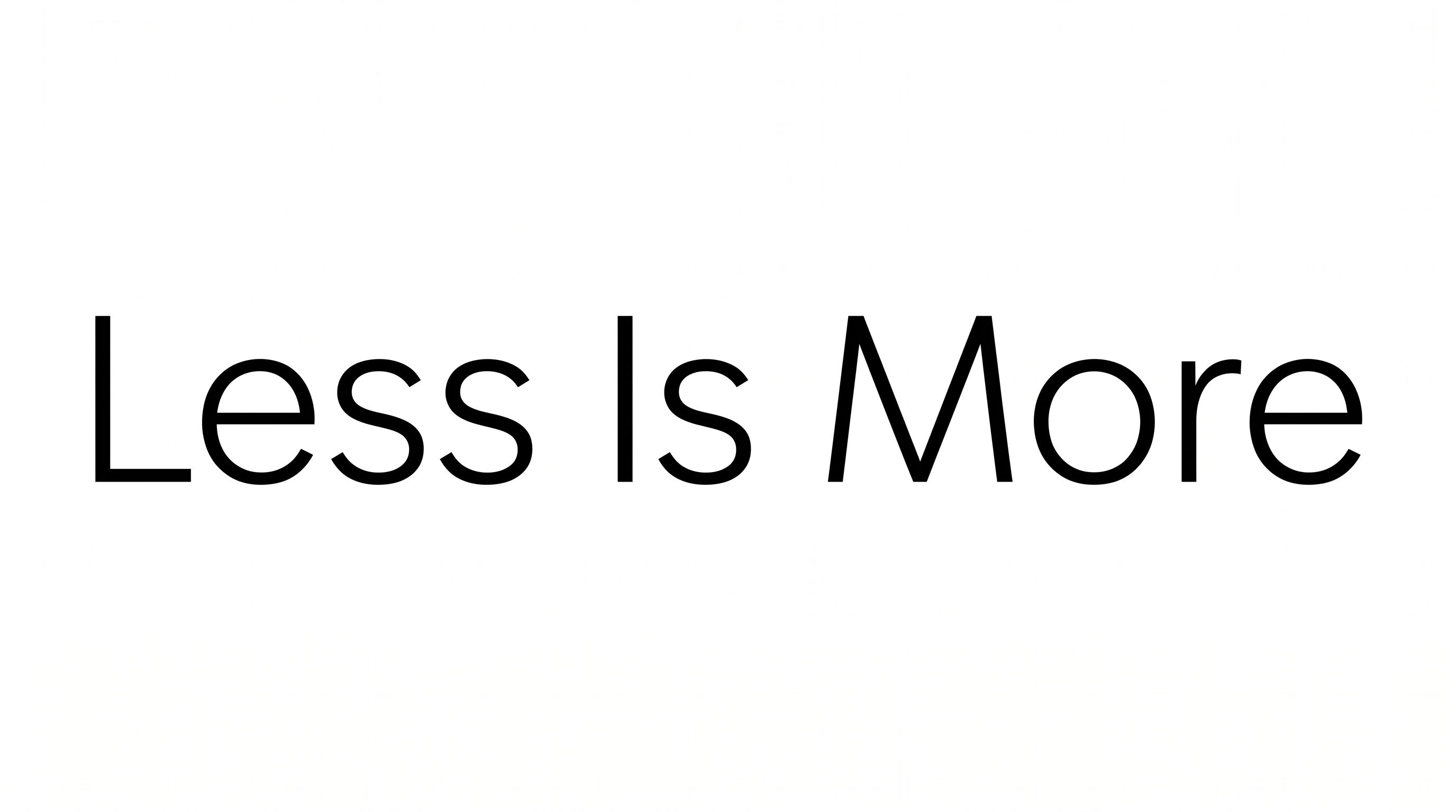
A consistent right slant, clean sans-serif construction, and separate characters define the lettering.

  • Slant

    The letterforms lean consistently to the right along a level baseline.

  • Letter Construction

    Clean sans-serif shapes use smooth, continuous strokes.

  • Letter Connections

    Letters remain separate, with clear breaks between neighboring characters.

  • Stroke Weight

    The visible letter bodies use a light-to-medium, mostly even weight.

  • Letter Spacing

    Moderate gaps keep neighboring letters distinct within each word.

  • Flourishes

    Simple letterforms keep decorative extensions restrained.
Frequently asked questions about Calibri Italic Font Generator

It turns your wording into a clean, right-leaning humanist sans-serif text image. The restrained style works well for wordmarks, names, headings, and other graphic lettering.

Yes. You can use the generator and download the resulting artwork through the supported free-use options. PNG and SVG image downloads are available, while project usage remains subject to the applicable membership terms.

Commercial use requires the higher membership, while the minimum membership covers personal use. Review pricing to choose the membership that applies to your project.

Browse the related tools section and compare each style by slant, construction, spacing, and overall tone. Test the same short phrase across tools to make the visual differences easier to judge.

Use the free Calibri Italic Font Generator for a concise heading, then preview the image at its intended online size. Leave open space around the lettering and avoid crowding it with detailed elements.

Place it where the rightward slant can guide attention toward the next visual element. For a cover or poster, give the heading open space and align supporting details to a stable edge.

Its restrained humanist sans-serif appearance suits editorial covers, name graphics, presentation headings, packaging labels, and signs. Short phrases usually preserve the clearest visual hierarchy.

Pair the clean italic forms with simple geometric shapes, reserved photography, or a clear supporting type style. Keep surrounding decoration restrained so the slanted heading remains distinct.

The clean construction creates a professional, approachable mood, while the rightward slant adds gentle movement. It can support editorial, corporate, or personal designs that need understated energy.
READY TO CREATE?

Create Custom Calibri Italic Fonts & Text Effects

Try Calibri Italic Font Generator Free