
Free Medieval Drop Cap Font Generator Online
Create tall, high-contrast serif lettering with monumental proportions and intricate monochrome manuscript framing for formal display artwork.
- Templates
- 260
- Generations
- 182
- Downloads
- 213
- Rating
- 5.0
How to Use the Medieval Drop Cap Font Generator
Build formal serif lettering with a suitable composition, then review and download the finished PNG artwork.
- 01
Enter the display wording
Type a short title, name, or initial phrase for the tall serif lettering.
- 02
Choose the composition
Select an image size such as 2:3 or 16:9, then adjust available color or background options.
- 03
Review and download PNG artwork
Check the letter shapes and spacing, then download the generated PNG image for your design.
Medieval Drop Cap Font Generator in Use: Design Examples & Showcase
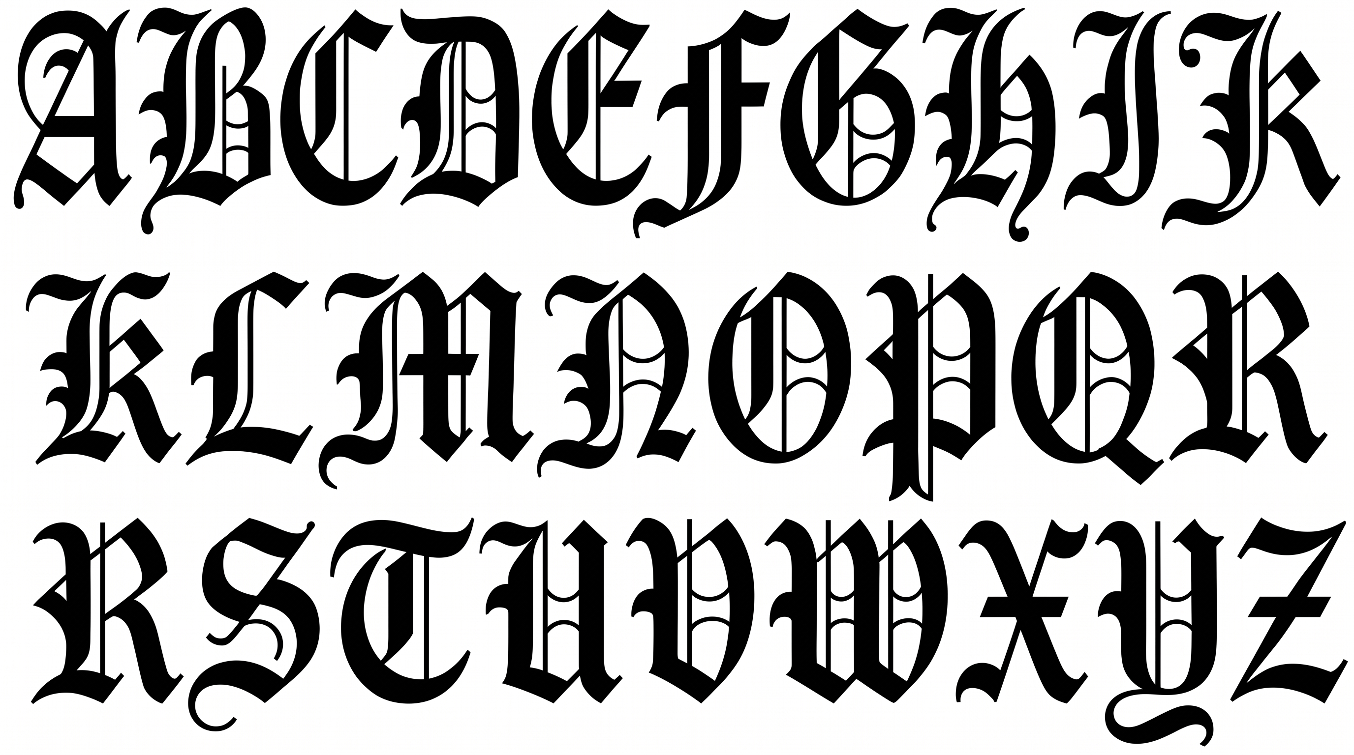
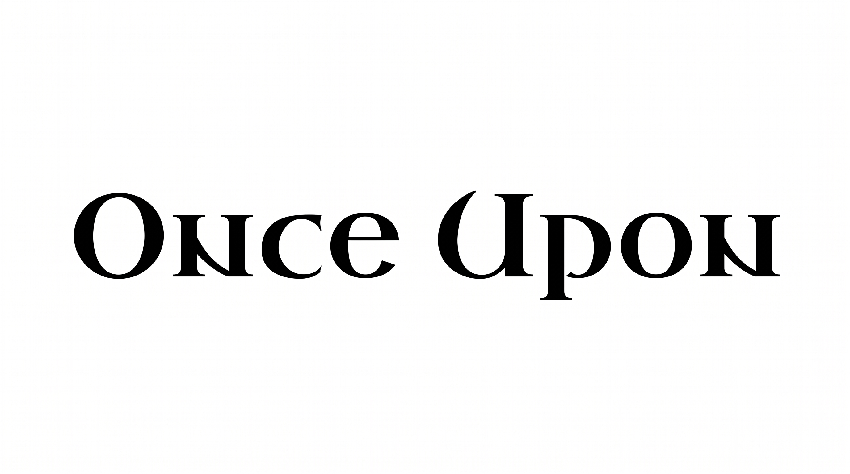
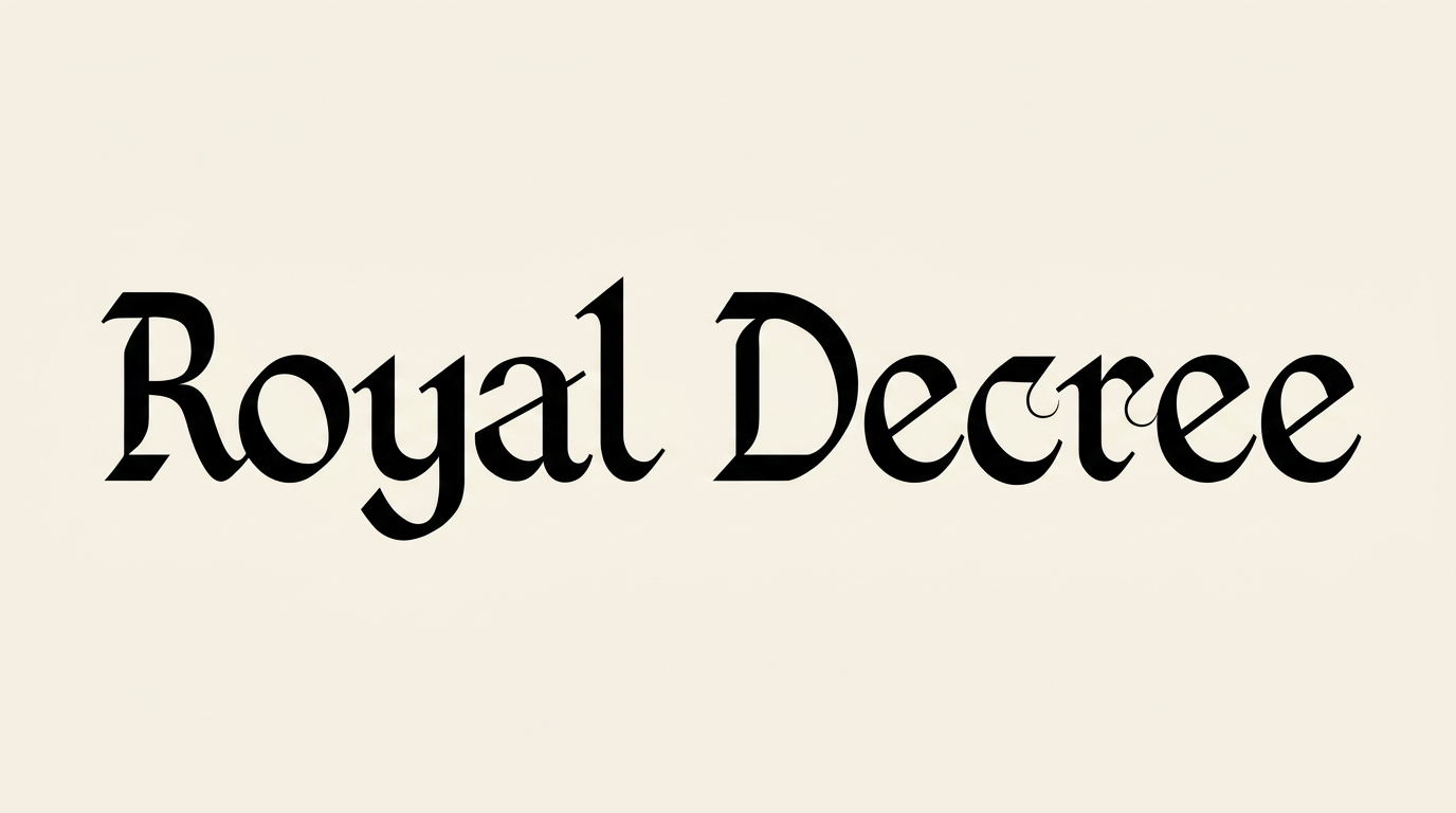
Compare framed initials, alphabet specimens, book covers, labels, stationery, menus, and other formal lettering applications.
Medieval Drop Cap Font Style Profile
High-contrast serif strokes, tall proportions, and compact spacing shape the visible lettering.
Stroke Contrast
Strong thick-and-thin variation gives the letters a high-contrast serif appearance.
Letter Width
The alphabet uses tall, narrow individual letter proportions.
Stroke Endings
Crisp serifs define the visible ends of the letter strokes.
Letter Construction
Each character is built as a separate, solid serif letterform.
Letter Spacing
Close gaps arrange the uppercase characters in compact lines.
Stroke Weight
Dark letter bodies give the uppercase forms substantial visual presence.