
Get 5 Free Credits

Free Arial Font Generator Online

Create clean, neutral sans-serif lettering with upright forms and clear spacing for signs, editorial covers, or interface graphics.

Enter the text to generate, e.g. Fontify.ai

Font color
Background
Templates
324
Generations
92
Downloads
239
Rating
5.0

How to Use the Arial Font Generator

Shape clean, neutral lettering for readable signs, covers, and interface graphics.

  1. 01

    Write your heading or label

    Enter a short heading or label to suit the clean, neutral sans-serif style.

  2. 02

    Set the color and image size

    Choose a font color, background, and an image size such as 16:9 before generating.

  3. 03

    Download the finished artwork

    Review the clear letter spacing, then download the finished artwork as PNG or SVG.

Arial Font Style Profile

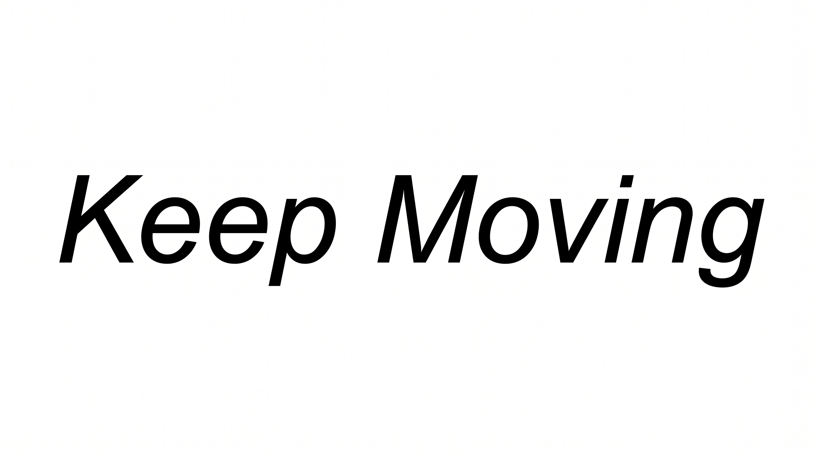
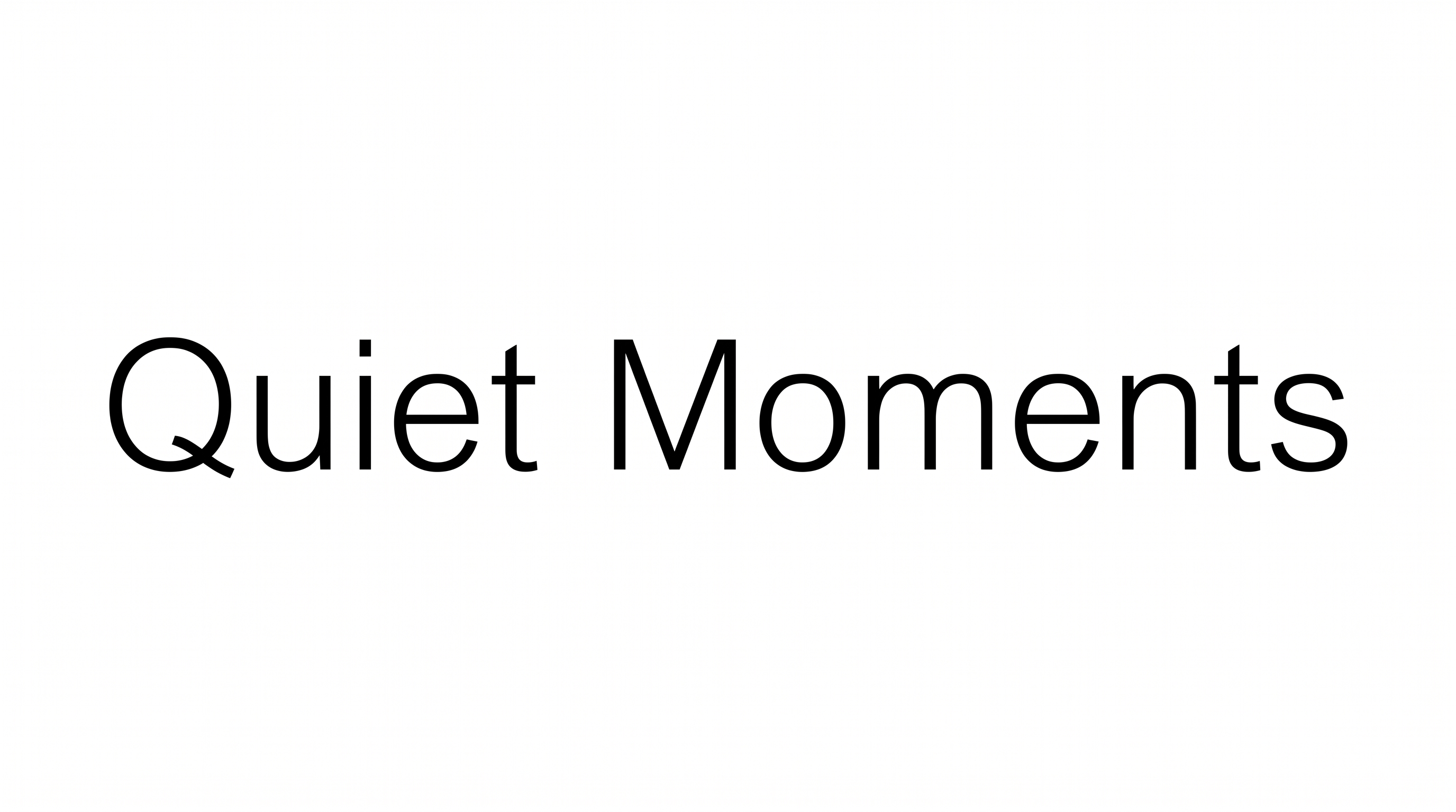
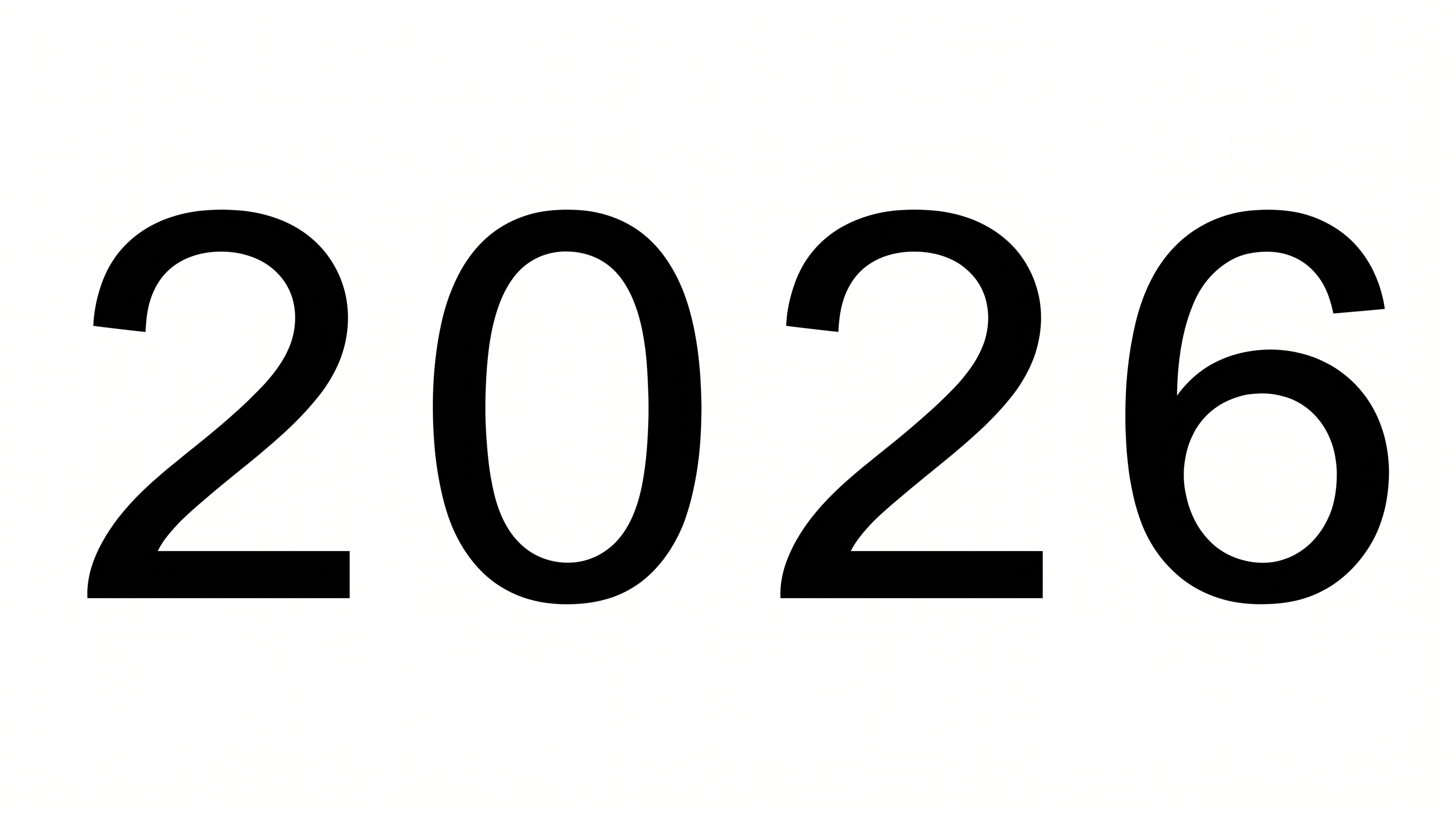
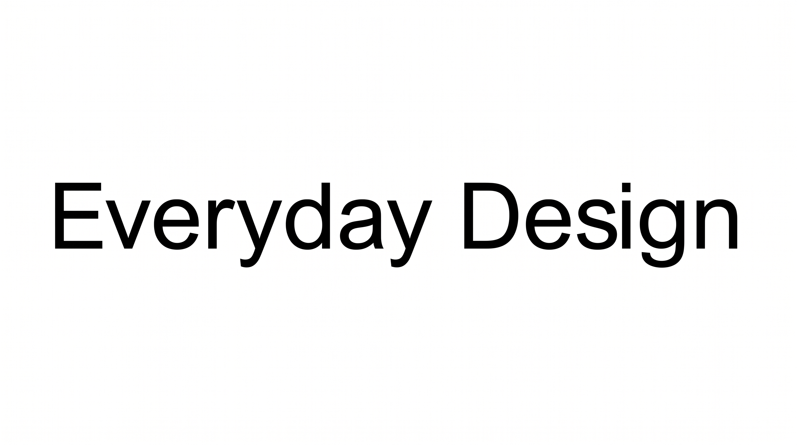
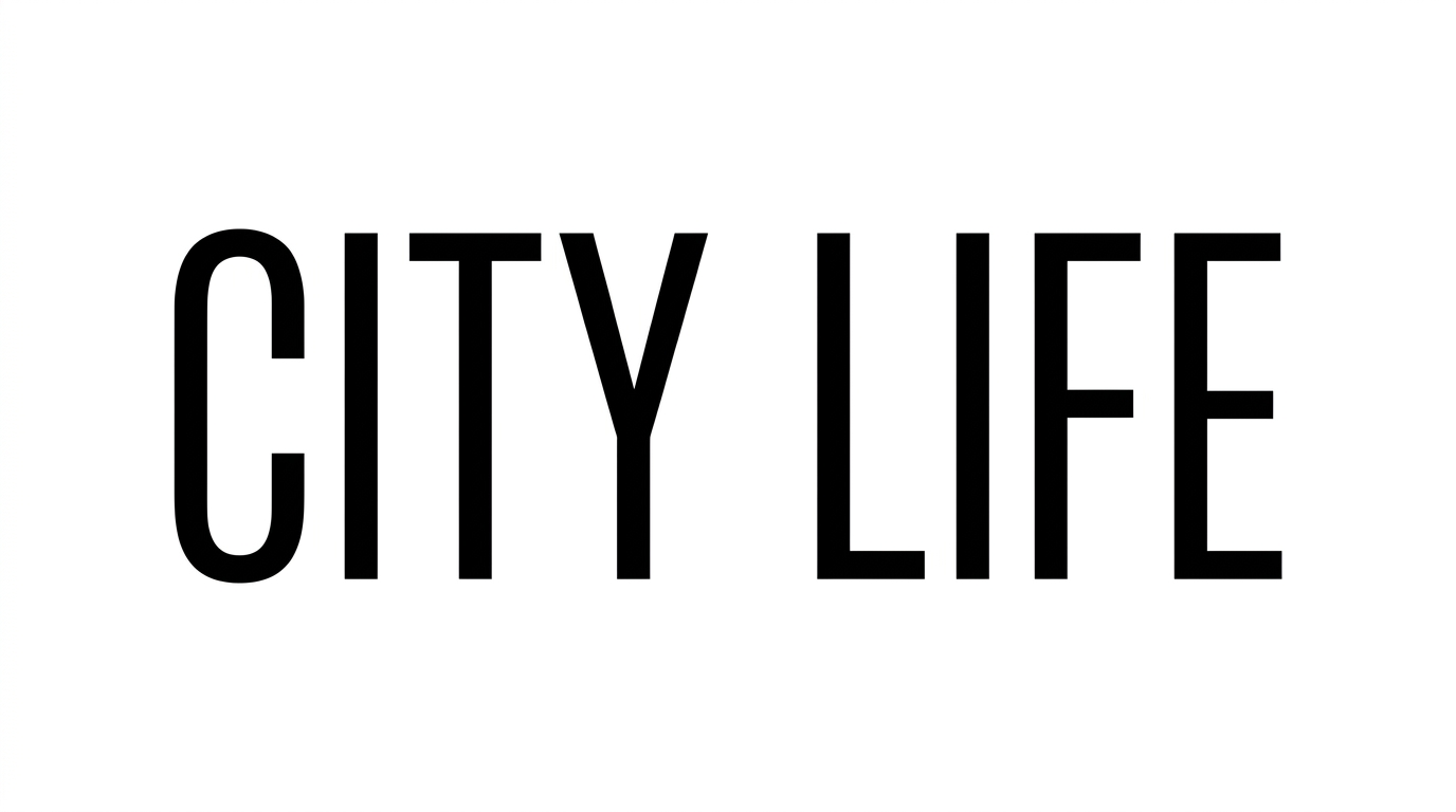
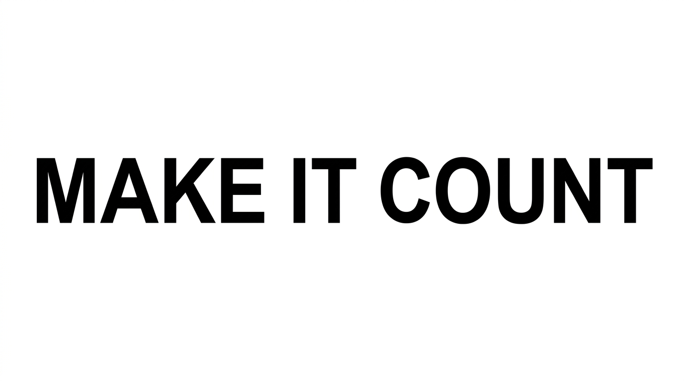
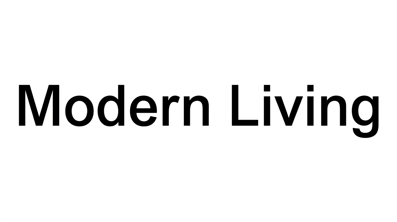
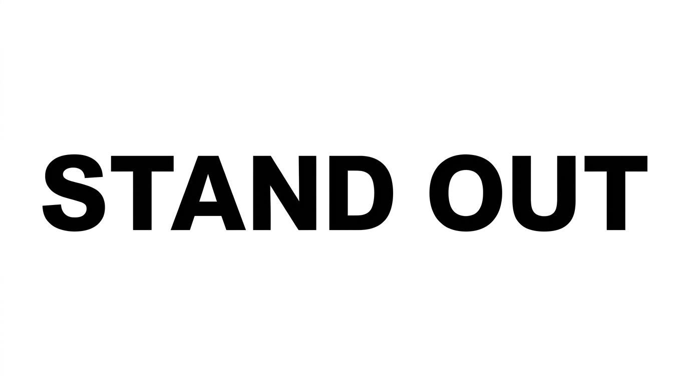
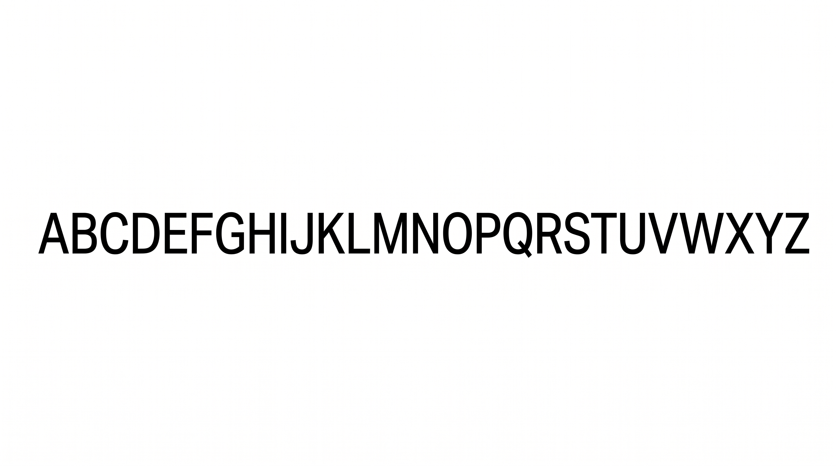
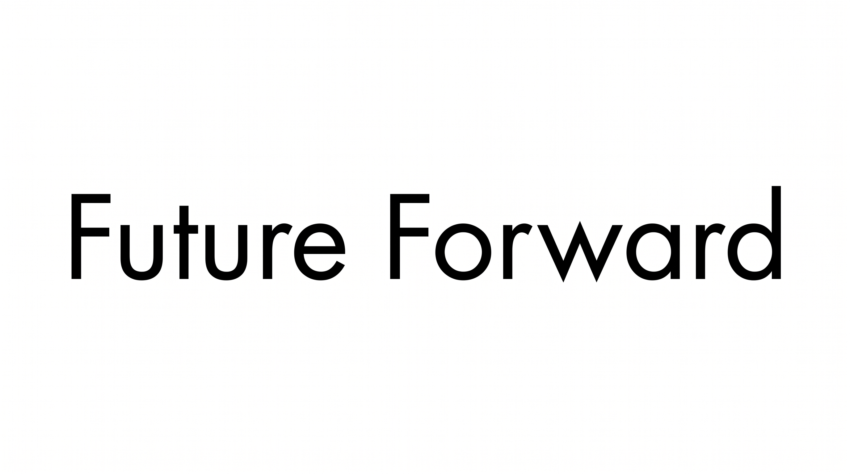
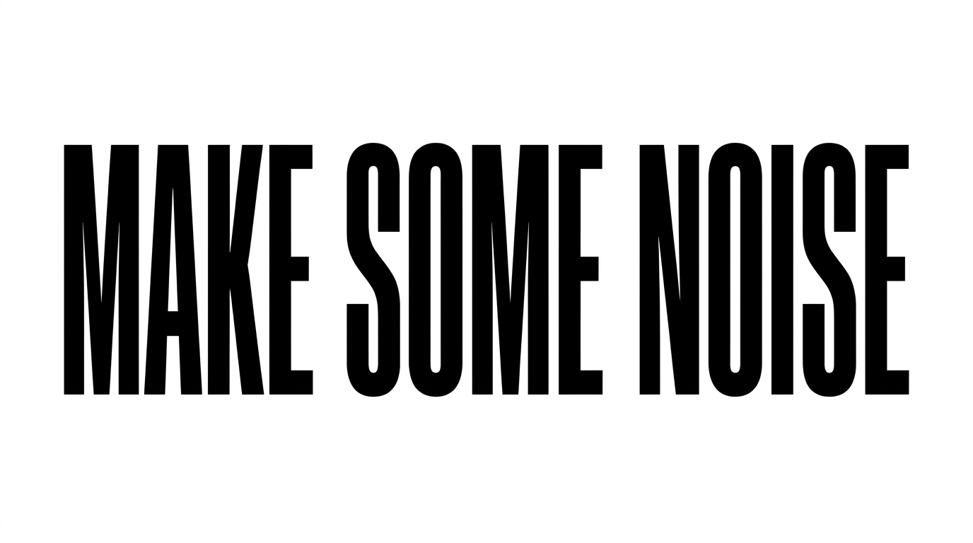
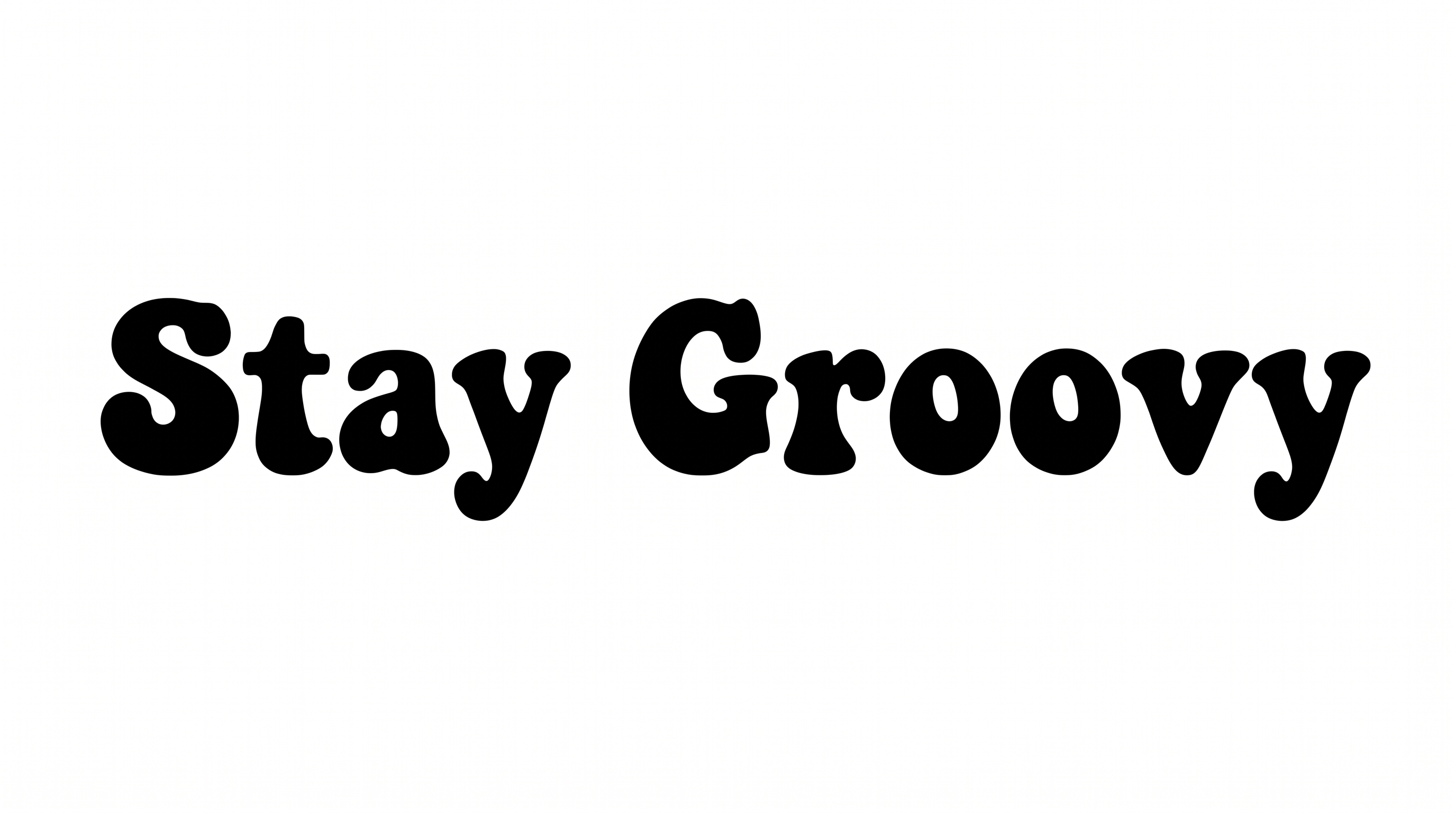
Upright, evenly weighted sans-serif letters use separate forms, steady baselines, and solid black color.

  • Letter Construction

    Continuous, clean strokes build straightforward sans-serif letterforms.

  • Stroke Weight

    Medium, mostly even strokes keep the visible letters clear and restrained.

  • Slant

    The letters stand upright relative to the baseline.

  • Letter Connections

    Letters remain separate, with clear breaks between neighboring characters.

  • Baseline Rhythm

    Characters align on a steady baseline across the displayed words and alphabet.

  • Color Treatment

    Solid black fills the letterforms consistently in both visible specimens.
Frequently asked questions about Arial Font Generator

Download the generated lettering as a PNG. Upload it in Canva, insert it into a Google Docs document, and import it into a project in the Cricut app. The Cricut app is also known as Cricut Design Space.

Transparent backgrounds are supported for layering lettering over other artwork. This template also lets you choose a font color, set a custom background color, or upload a background image. Transparency is an output option, rather than proof that every generated design uses it by default.

Yes. You can try the generator for free and download the result as PNG or SVG. The minimum membership covers personal use; see pricing for the applicable membership.

Browse the related tools section and compare examples by construction, spacing, weight, and overall mood. This helps you choose a lettering direction that fits your layout while keeping the comparison focused on visible design qualities.

Choose an aspect ratio that gives the wording enough horizontal room. Keep labels concise and preserve open space around the text. Review the image at its intended display size so the separate letterforms remain easy to scan.

Use the lettering as a restrained headline and place it where the surrounding image has visual space. A clear hierarchy between the headline and supporting details suits the clean, neutral construction shown in the examples.

Pair the lettering with simple geometric shapes, restrained photography, or a limited color palette. Its upright sans-serif forms support orderly compositions where imagery and supporting information need a calm visual relationship.

Leave generous margins around the heading and separate it clearly from secondary details. The open area emphasizes the steady baseline and simple construction while helping the composition feel measured and uncluttered.
READY TO CREATE?

Create Custom Arial Fonts & Text Effects

Try Arial Font Generator Free